CrossCurrents Fly Shop
Overview
CrossCurrents Fly Shop is a small business with two locations. Their main location, Craig, Montana and their secondary location, Helena, Montana.
Problem: The CrossCurrents webpage, over a decade old, suffers from broken links, outdated information, and a convoluted user experience. These issues are driving potential customers to competitors, seeking a more seamless shopping and booking experience.
Solution: Transform the digital presence by modernizing, simplifying, and reorganizing the desktop version while enhancing mobile accessibility, ensuring a smooth and user-friendly experience across all devices.
Understanding the User
Research Goals: Understanding the who the main demographic is and determine if the experience is desktop or mobile focused.
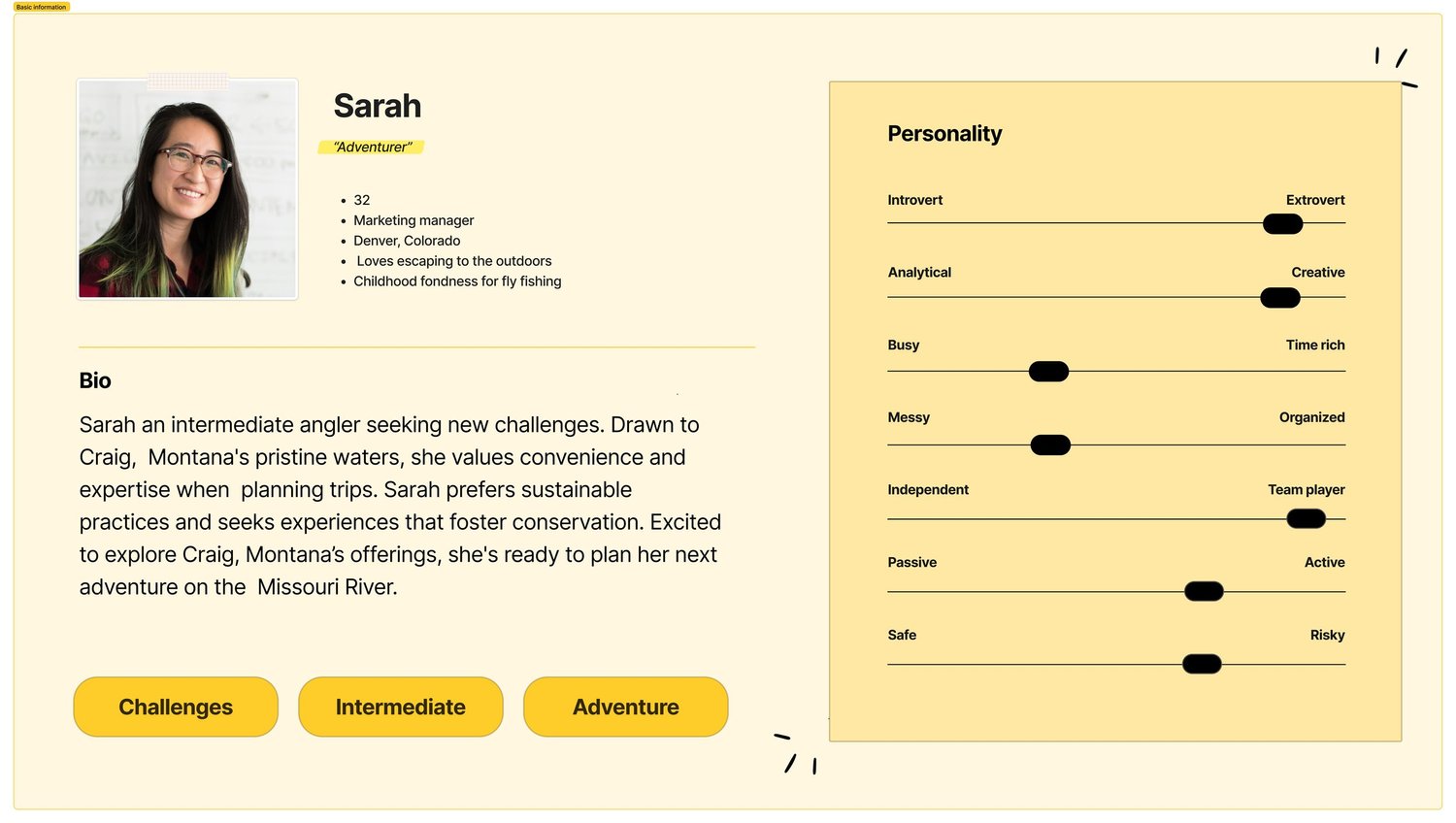
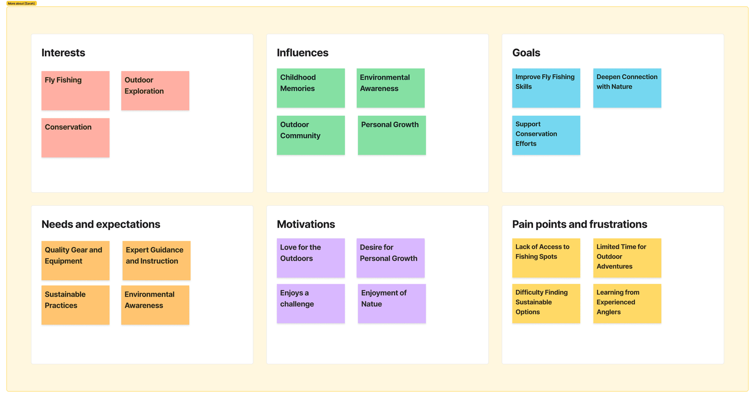
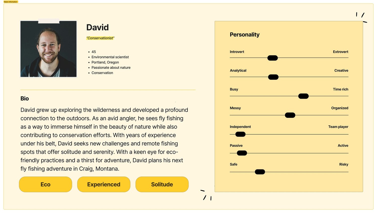
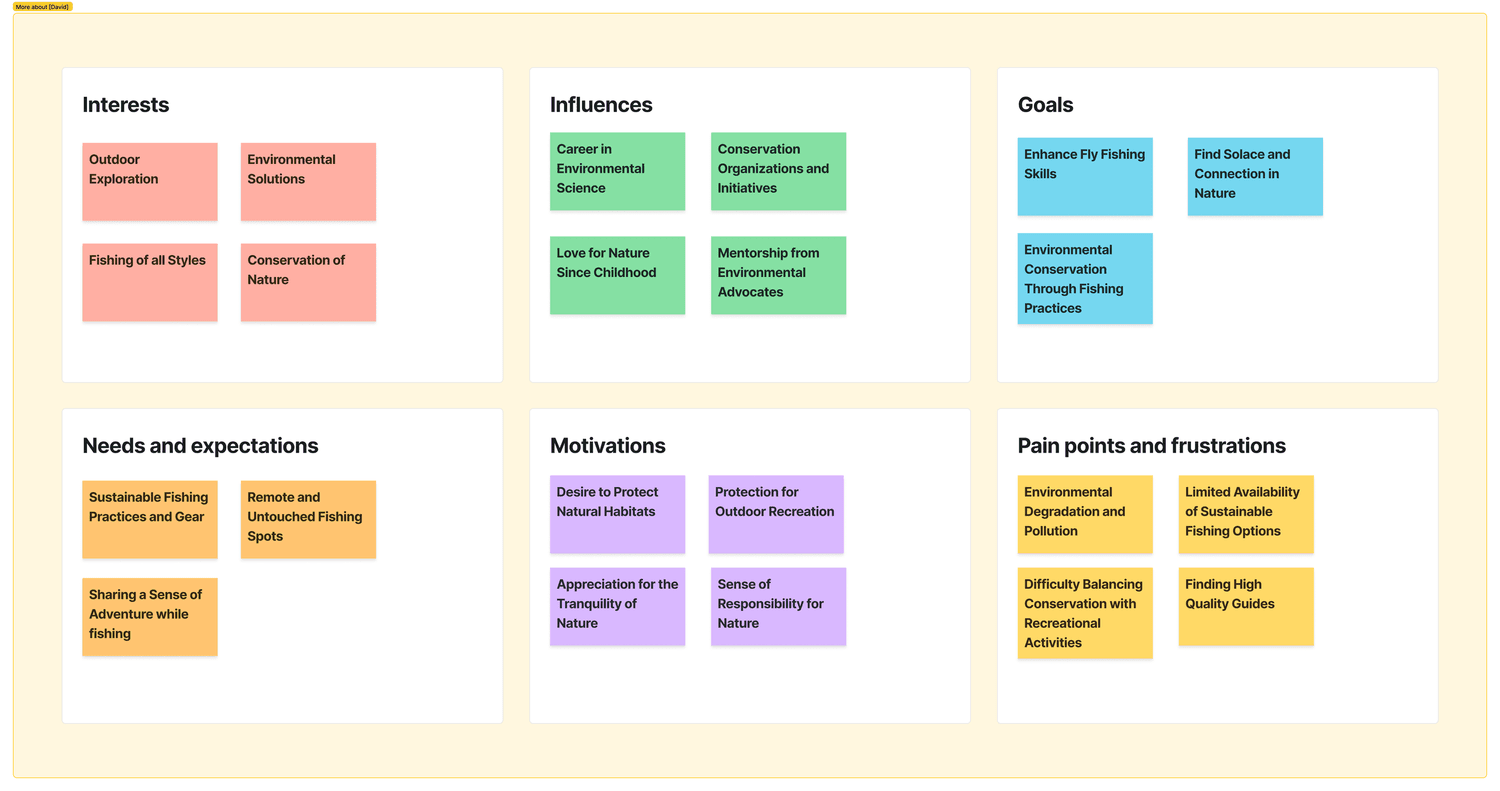
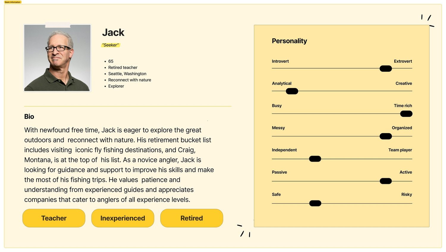
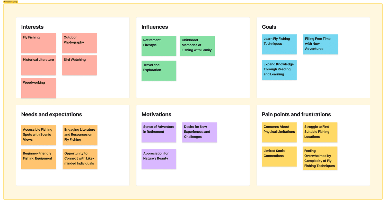
Methodologies: Competitive Analysis, User Personas.
SplideJS Carousel Test
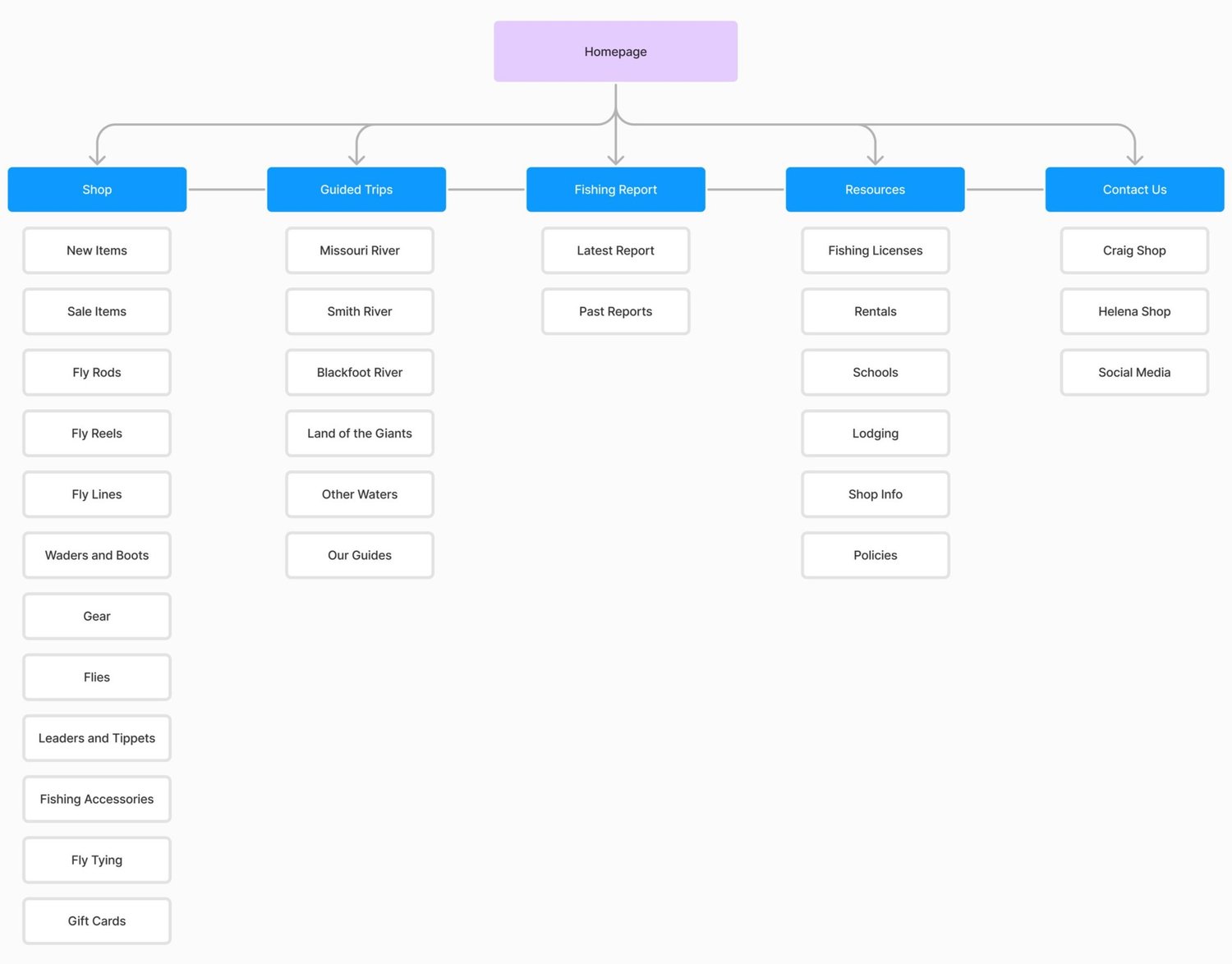
Information Architecture
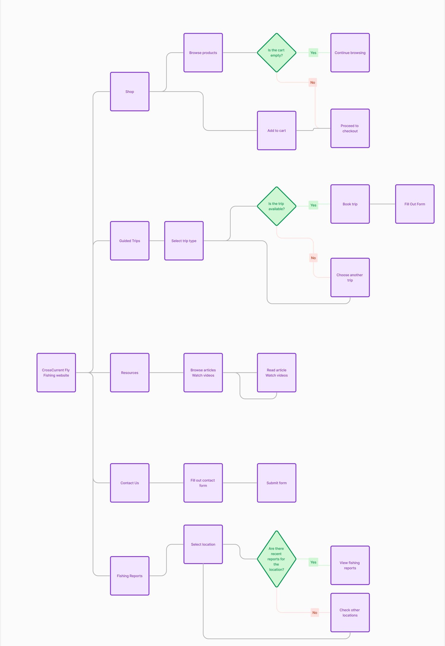
Site Map
Wireframes
The current structure of CrossCurrent’s webpage is not only complex but also plagued by inconsistent placement and UI elements throughout the web experience. My objective is to establish both a cohesive visual and information hierarchy, ultimately leading to a simpler, more intuitive user experience.
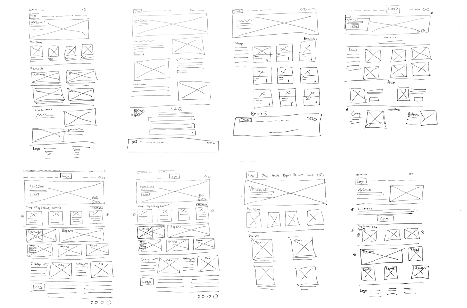
Usability Test
Following the initial iterations of multiple wireframes, usability testing was conducted both in person and with the Coursera Classroom Community. This applied to both the physical and digital wireframes.
User Interview Takeaways
- Multiple users found that the simplicity help navigation and what is the most important content.
- Verbiage was difficult to understand in areas and needed more explanation.
- Some visual hierarchy issues leading to users to have a negative impact on their experience.
Direct System Observations
- Confused users on what page they were on and what could be an active link.
- Adding additional subhead help the user understand what each section was going to navigate to and why.
- Adjust the design and simplifying both the header and footer allowed the user to be more familiar with common web navigation.
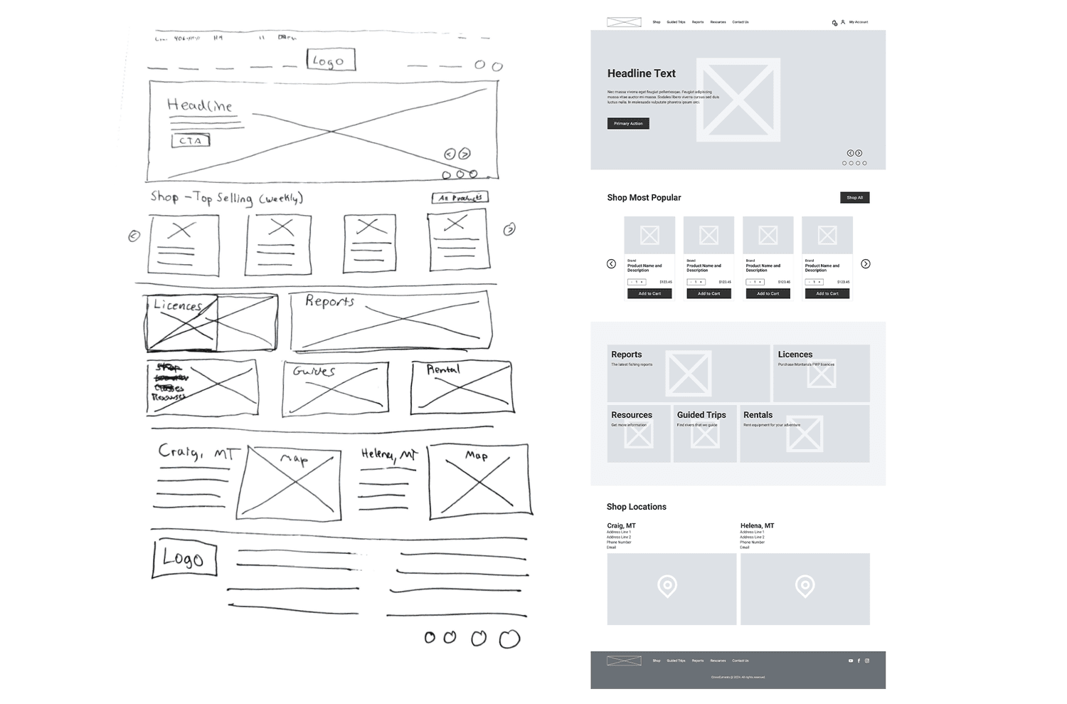
Wireframe - Digital
During the usability testing phase, I gathered insights from users' thoughts, comments, and concerns. These findings were then applied to enhance other pages of the website, ensuring a consistent and user-centered design across the entire site.
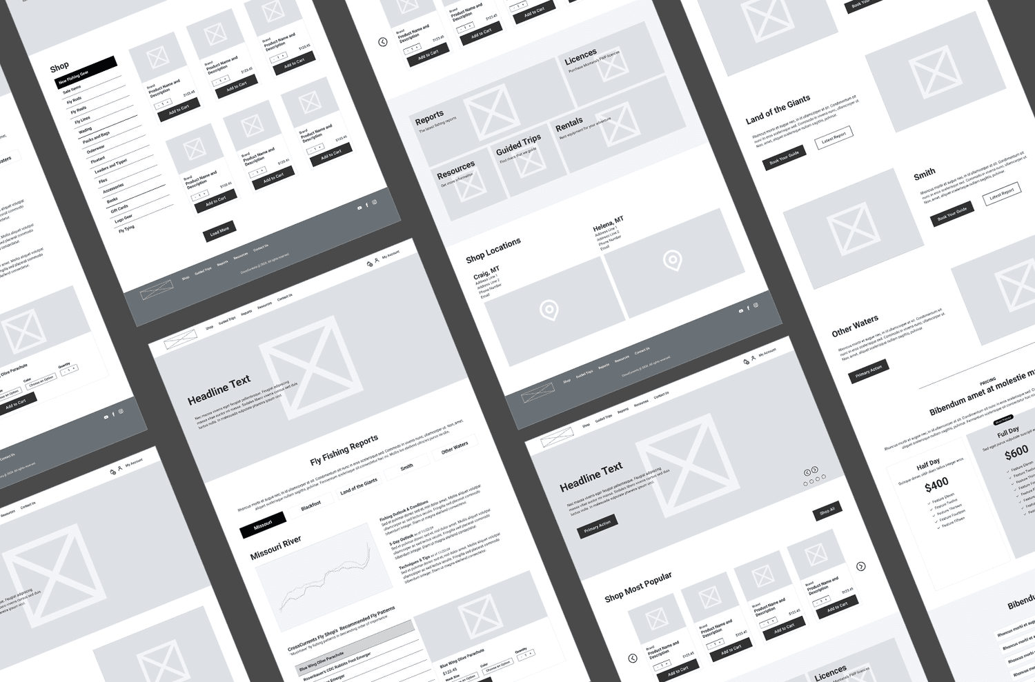
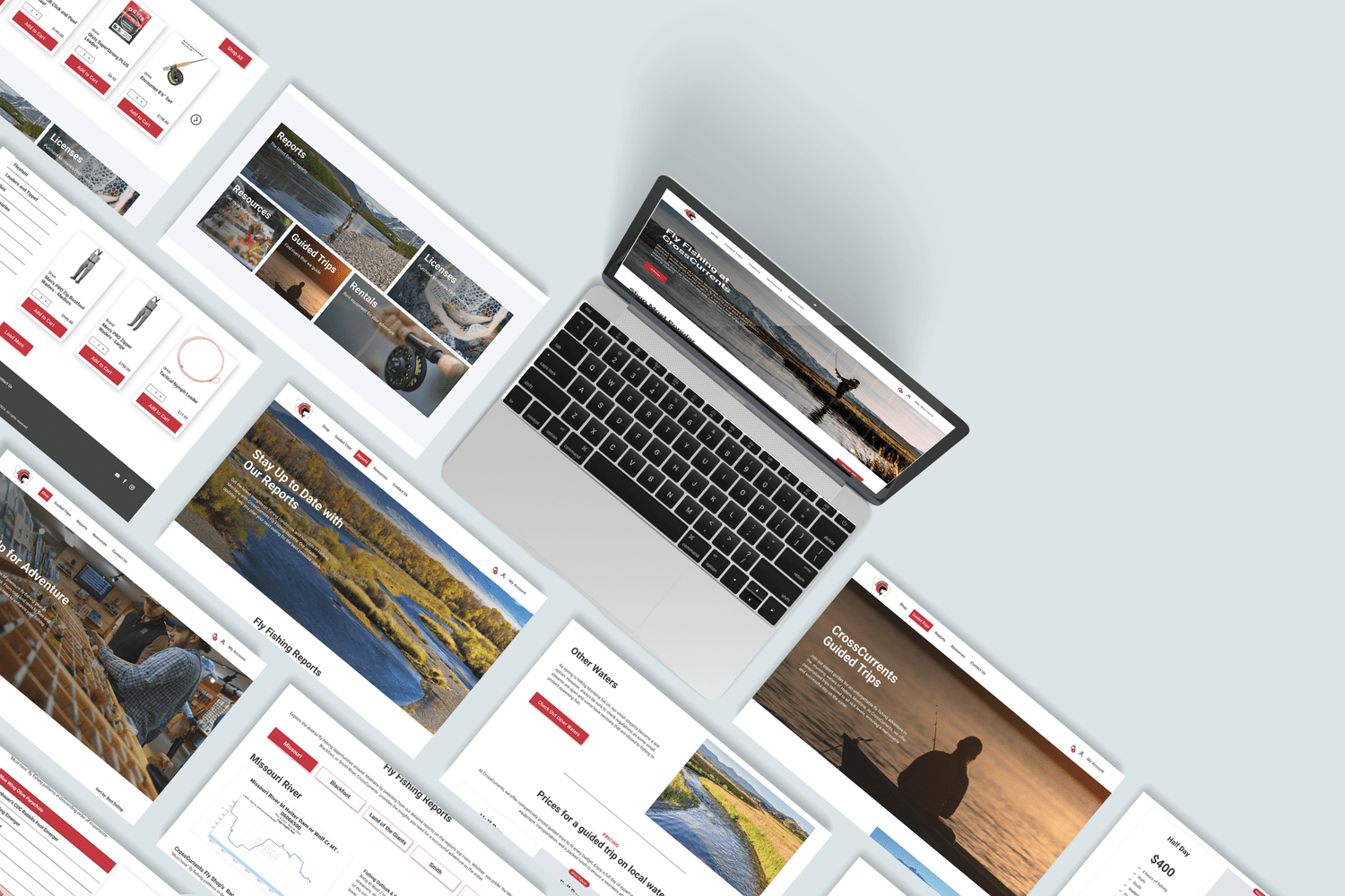
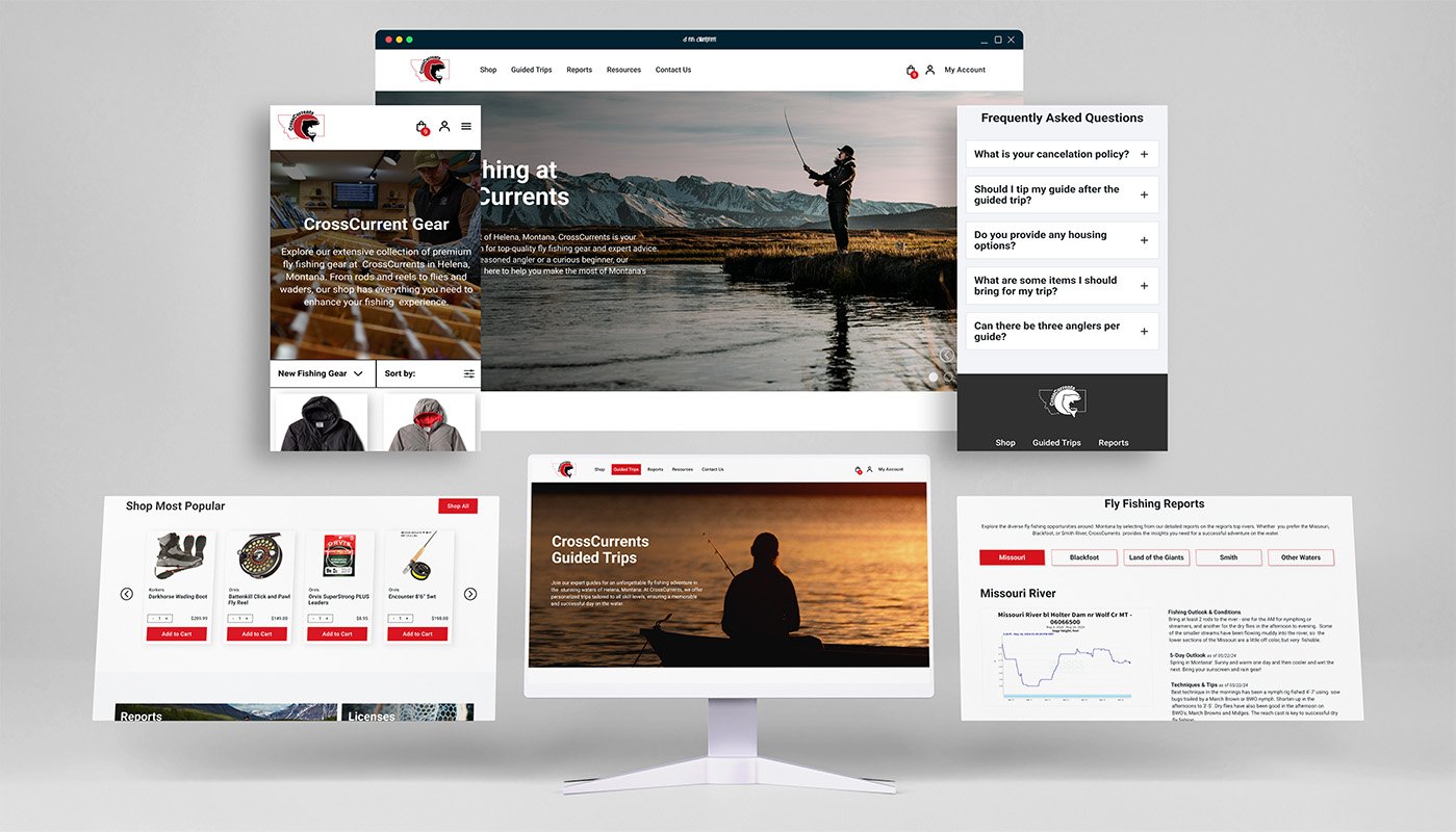
High Fidelity
High-fidelity mockups showcased the final design, ready for development and launch.
Takeaways
- Recognized and addressed personal biases to ensure they did not negatively influence project outcomes.
- Applied research-driven problem-solving to develop solutions that were both relevant and effective.
- Explored multiple design iterations to refine ideas and identify the best approach.
- Conducted regular testing to validate solutions and uncover areas for improvement.
- Simplified complex processes through clear flowcharts and streamlined prototype experiences.
- Maintained consistent design practices to accelerate the overall workflow.